Brand Resource Center for Agents
Air Liquide Brand Guidelines
Air Liquide’s visual identity has been created to convey the image of a leading Group, expert and innovator, that is close to its stakeholders and open to the world.
You may only use the approved brand assets that are provided on this site. Consistent use of these assets helps people easily recognise references to Air Liquide and protect our company trademarks. Any Air Liquide logos or images found elsewhere on the web are not approved for use.
Download the resources below to ensure consistent branding. If you need further information ask your Air Liquide representative.
-
Visual Identity Guidelines for Pacific AgentsDownload the document PDF (2.23 MB)
-
Air Liquide Industrial Gases logoDownload the document ZIP (2.04 MB)
Talking About Air Liquide
When presenting Air Liquide in your publications (brochure, catalogue, website, etc.) please use the following text:
Air Liquide is a world leader in gases, technologies and services for industry and healthcare. Present in 60 countries with approximately 66,500 employees, the Group serves more than 4 million customers and patients.
If you need more marketing or advertising information about Air Liquide’s products, please ask your Air Liquide representative.
Copy Standards
When mentioning Air Liquide in your copy/text.
DO
- Display the word “Air Liquide” in the same font size and style as its neighboring content.
- Capitalise the word “Air Liquide,” except when it’s part of a web address.
DON'T
- Don’t use Air Liquide logotype in place of words.
The Air Liquide logotype includes an "Alpha" symbol and the company name, which are inseparable.
There is a dedicated logotype for the use by agents and distributors, with the “INDUSTRIAL GASES” mention as a descriptor. The goal is for this descriptor to be meaningful yet short (has to fit between “A” and “e” of Air Liquide).
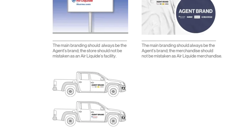
The Air Liquide logotype always co-exists with the Agent’s name or logotype.
To avoid being mistaken with Air Liquide facilities, vehicle/s or any other collateral:
- The Air Liquide logotype is never used by itself.
- It is never bigger than the Agent’s logo.
Ensure no other elements interfear with our logotype, it should remain clear and uncluttered. Additionally, ensure you keep the logotype at a legible size, no smaller than 30mm wide or 113px for digital applications.
To maintain consistency throughout the Air Liquide identity application it is essential that the main logotype is never altered in any way.
A few example are listed below:
- Descriptor can not be changed from “INDUSTRIAL GASES” to any other description.
- The size and position of elements can not be changes from the original lock-up.
- The logotype can not be deformed in any manner. For example do not stretch, rotate, add drop shadow, or change any colours.
- The logotype can not be cropped.
- The addition of other approved Air Liquide imagery can not be added to the logotype.
- Do not add any unauthorised imagery or shapes to the logotype.
- Do not use any older versions of our logo. Or any other veriations such as Air Liquide Healthcare.
Avoid representing the Air Liquide brand in a way that:
- The main branding should always be the Agent’s brand; the it should not be mistaken as Air Liquide.
- Puts the brand in a negative context as part of a script or storyline.